Artful Design Chapter 1: Reading Response
In this week’s reading of Artful Design, there was a particular principle that stood out to me:
Principle 1.15: Design not only from needs – but from the values behind them.
Most of the CS education that I have obtained at Stanford emphasizes the need to design computer systems and machine learning models that are meant to be efficient and reliable. Of course, it makes sense in context that we would want to design these things in such ways; who the hell would want to have a machine learning model that takes forever to classify a picture a plant into its correct species, only for that classification to wrong most of the time. Such a model would be useless and counterproductive to anybody who adopts it. It seems to me that in the context of these fields, the values are informed by the needs. And these values and needs are inextricably linked to the doctrine of optimization. If the CS department at Stanford would ever have a religion, it would be the Church of Optimization.
In addition to this, reading through this principle reminded me alot of my time studying abroad in Japan during my undergrad. When I studied in Kyoto during the spring of my sophomore year, I took a class on analyzing Japanese ceramics, and one of the notable things about the Japanese pottery that I frequently saw were the values that it embodied. In particular, wabi-sabi.
Wabi-sabi is an aesthetic sensibility that places great emphasis and acceptance of imperfections of things. This is very common in Japanese ceramics. For example, take a look at this ceramic piece:
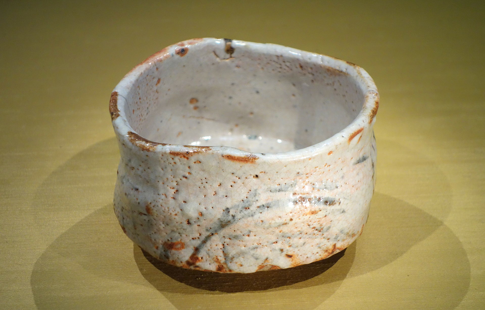
The pot above is made in a certain style called shino ware. This style of stoneware is often denoted by thick white glazes, red scorch marks, and tiny holes. Note how this pot has certain asymmetries inherent in its shape. These elements taken together can be seen as imperfections. Compare this with a typical blue and white pottery piece from Ming-era China:
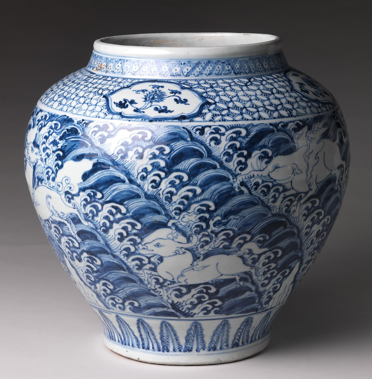
Notice the near-perfect symmetric shape of the jar, as well as the intricate and complex patterns painted on it, depicting a scene in nature with animals frolicking about. Below and above the scene are symmetrical patterns as well.
These two pieces could not be more different from each other. Whenever I look at the products that big tech companies offer out, such as iPhone, one can’t help but notice the emphasis that is placed on making said products look perfect. They just try so hard, with the ways in which they mold their edges, much in the same way as the Ming-dynasty piece. However, I sometimes wonder, what if tech products weren’t made with the same emphasis on perfection? What if we had phones whose shapes were molded in the style of shino piece? I think that would be so interesting to see.
Design Etude #1
Part 1: Taking Notice
Here are three objects that I find to have a great design:
- This Bananagrams pouch in my apartment:

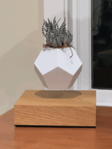
- This rotating plant pot in my apartment’s living room:
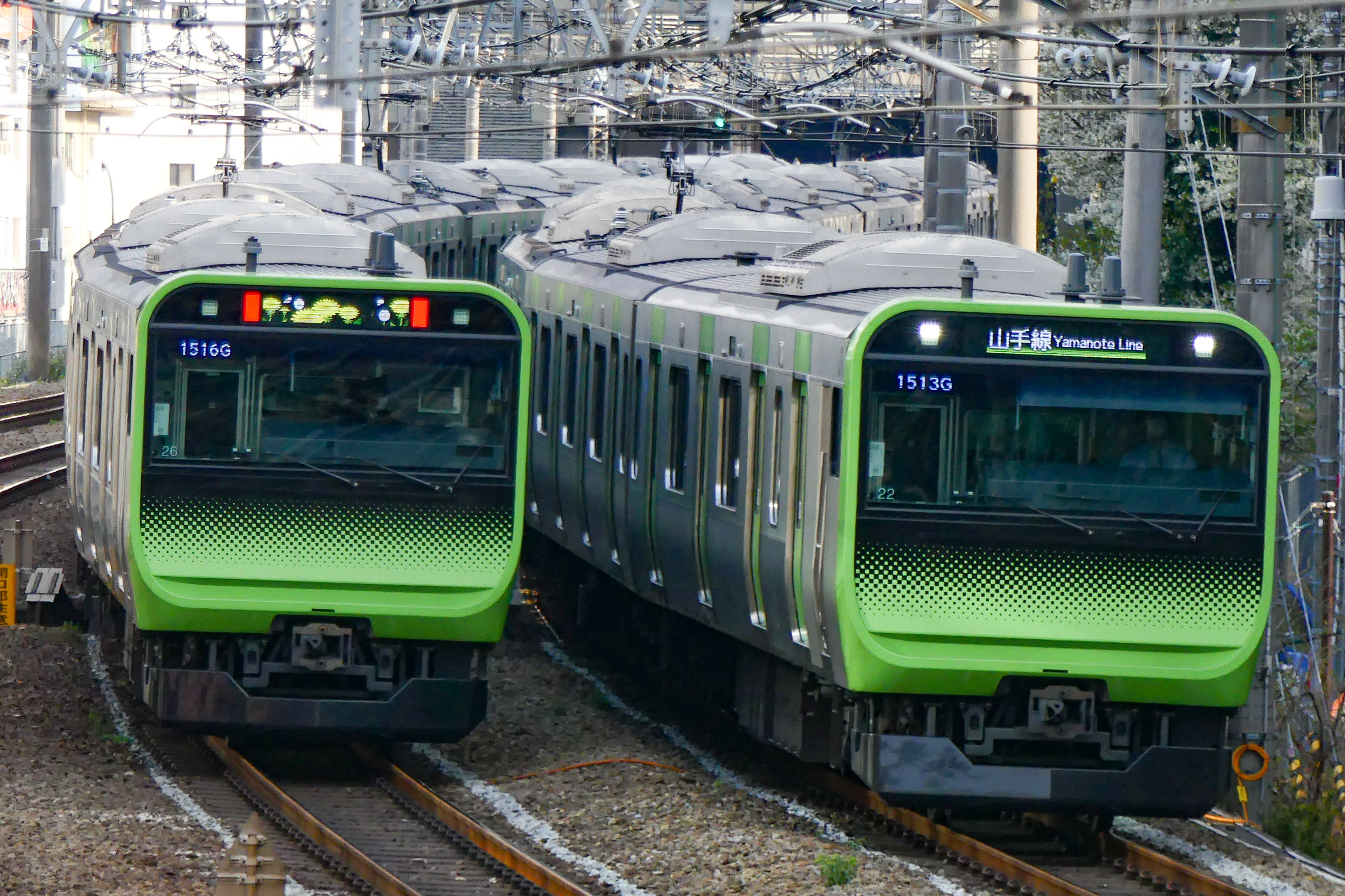
- The Japanese Train System:
Part 2: Means and Ends
- Bananagarms:
I find this beautiful because its form follows from the game that it itself houses. Bananagrams is a scrabble-like game that “will drive you bananas” according to the tagline (it does). It’s just simply shaped like a banana, and I just find it to be so cute. It makes me want to hold it and hug it and protect it. It functions as a pouch that holds all of the game pieces, which makes it very convenient, and its form allows it to do its job well while being elegant and cute. Its means-to-and-end is to have a zipper and be a concave pouch to store game pieces in, and the end-in-itself it speaks to is cuteness.
- Rotating plant
I think this rotating plant is awesome to look at. It just keeps going. It reminds me how the world just keeps turning. Nothing is ever still, really. It perfectly serves the function to house a plant. Its form and its aesthetics are completely superfluous. Does that matter? No. Why? Because it’s fucking awesome. That’s why. Its means-to-an-end is the pot structure to house a plant. And the end-in-itself it fulfills is being cool.
- The Japanese Train System
I think the Japanese Train System is elegant because its trains are on time, punctual, and clean. Basically, everything that public transportation in the Bay Area is not and doesn’t even pretend to try to be. It instills a sense of awe in me, as well as safety, and it’s meaningful to me because it’s reliable. Moreover, the trains have a nice interior that is pleasant to look and wait at during rides. The system’s purpose is to get someone from point A to point B in the most efficient way possible at a reasonable cost. The aesthetics help give a sense of credibility to the train, with their cleanliness and multiple hanging handrails to service commuters. Moreover, their musical jingles when they arrive and depart at Stations are just so cute and memorable. This is a train system that knows its stuff. The means-to-and-end it serves are their punctuality, safety, and reliability. Their end-in-itself it speaks to is whimsy, especially with their jingles.
Part 3: Guerrila Design
A map to my apartment with a bit of more design.
*refuses to elaborate*
*leaves*
ChucK Program Link
Here’s a link to a simple ChucK program implementing really simple FM-synthesis!: